By insideSail
Automated technical check · version 2 ·
Reading patterns on a synoptic chart
Isobars, centres and fronts describe related layers.
In this guide
A synoptic chart summarises an atmospheric field over an area at a declared time or interval. Analysis and forecast can use similar symbols while having different time origins.
Before interpreting the drawing, identify variable, level, validity and product type. A mean-sea-level pressure chart is not automatically a wind chart at mast height or a wave forecast.
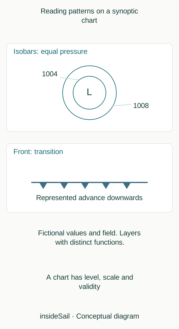
Conceptual schematic not to scale; no local forecast or operational decision.
insideSailOriginal insideSail artwork — all rights reservedEnlarge the diagram
Equal-value curves, different spatial relationships
An isobar joins points of equal pressure. Spacing between successive values informs pressure gradient when pressure interval and spatial scale are known.
Two charts with equally spaced screen lines can represent different gradients if scales or intervals differ. Isobars need not be perfect circles: the field can contain centres, ridges, troughs and elongated structures.
High and low centres describe relative extremes in the field. Fronts add transitions between air masses.
A ridge extends relatively high pressure; a trough extends relatively low pressure. A trough line is not necessarily a front.
The figure separates abstract patterns so that an equal-pressure line is not confused with an air-mass boundary.
Comparing times reveals movement and development, but does not make a drawn track certain. A synoptic chart supplies broad-scale context; smaller phenomena, coast and terrain may require other products.
This conceptual reading lesson derives no exact wind speed, local rain onset or departure decision from line shape.
A chart may reduce pressure to mean sea level to compare locations at different elevations. That variable is not simply every raw barometer reading from mountains and cities.
Reference level or surface belongs to the field. “Pressure” can appear on products at different levels with different interpretations.
Identifying the field avoids combining incompatible curves.
An analysis combines observations with interpretation, while a forecast shows a calculated state for another time. Products from different runs can share validity time.
Comparing issues shows scenario revision; comparing validities shows forecast development. These are two reading axes.
The diagram is explicitly fictional and contains no actual coastline to avoid appearing operational.
- Read variable, level, scale and validity.
- Isobars and fronts represent different things.
- Spacing needs pressure interval and distance.
Sources and references
- High and low pressure ↗
Met Office · Characteristics of highs/lows; pressure gradient; Northern Hemisphere circulation.
Broad physical distinctions only; no pressure threshold or deterministic weather rule.
Checked on - How to read synoptic weather charts ↗
Met Office · Isobars and pressure patterns; frontal symbols; troughs.
Original abstract chart. No actual forecast, route recommendation or source chart reproduced.
Checked on
Keep discovering
The next piece of the puzzle
Discuss this concept
Loading the conversation…